CRAFTING A NEW WONTON ERA.
THE STRATEGIC SHIFT.
For 70 years, JINJIA was a trusted family staple.
We transformed it into a premium frozen retail brand
where quality, design, and desirability lead the choice.
From “buy when needed”
to “choose because it’s worth it.”
REDEFINING WONTON CULTURE.
From traditional family comfort
to boutique frozen retail.
JINJIA was repositioned as a premium wonton brand
where heritage meets innovation,
and convenience becomes a curated experience.
01
FROM NEED
TO DESIRE
Reframed JINJIA
from a functional staple
into a premium lifestyle choice.
Shifted the purchase logic
from “necessary”
to “intentionally chosen.”
02
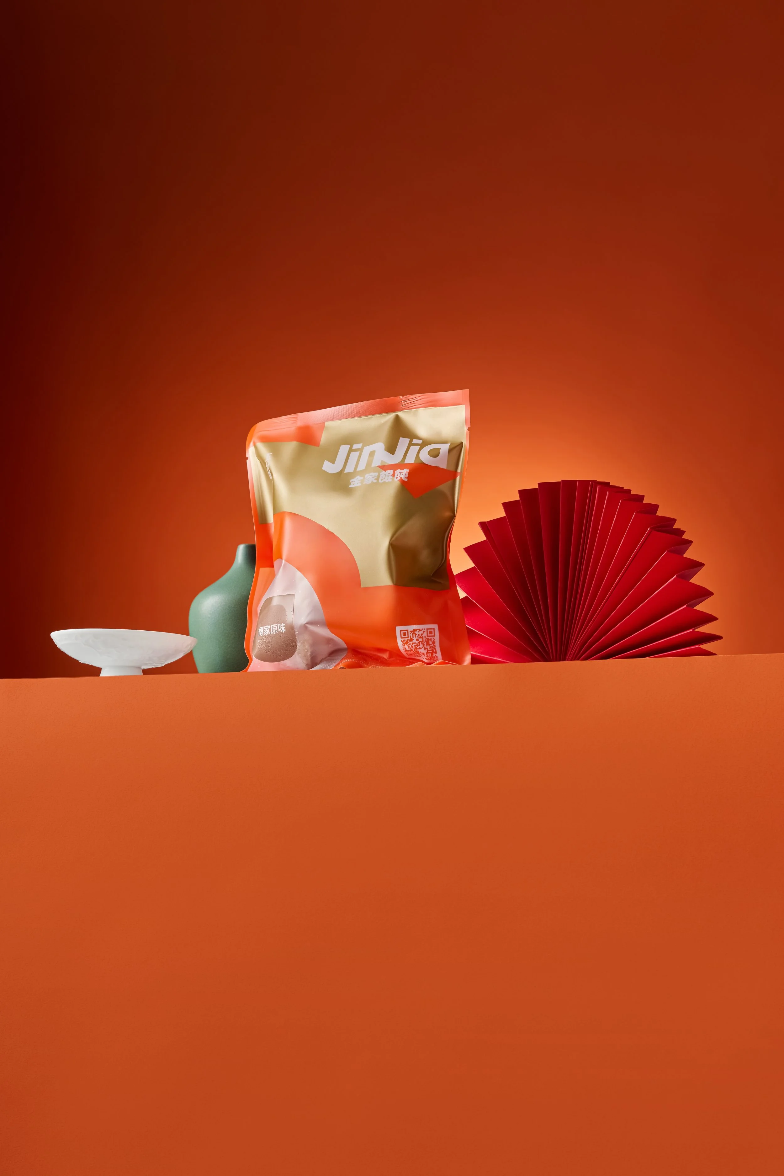
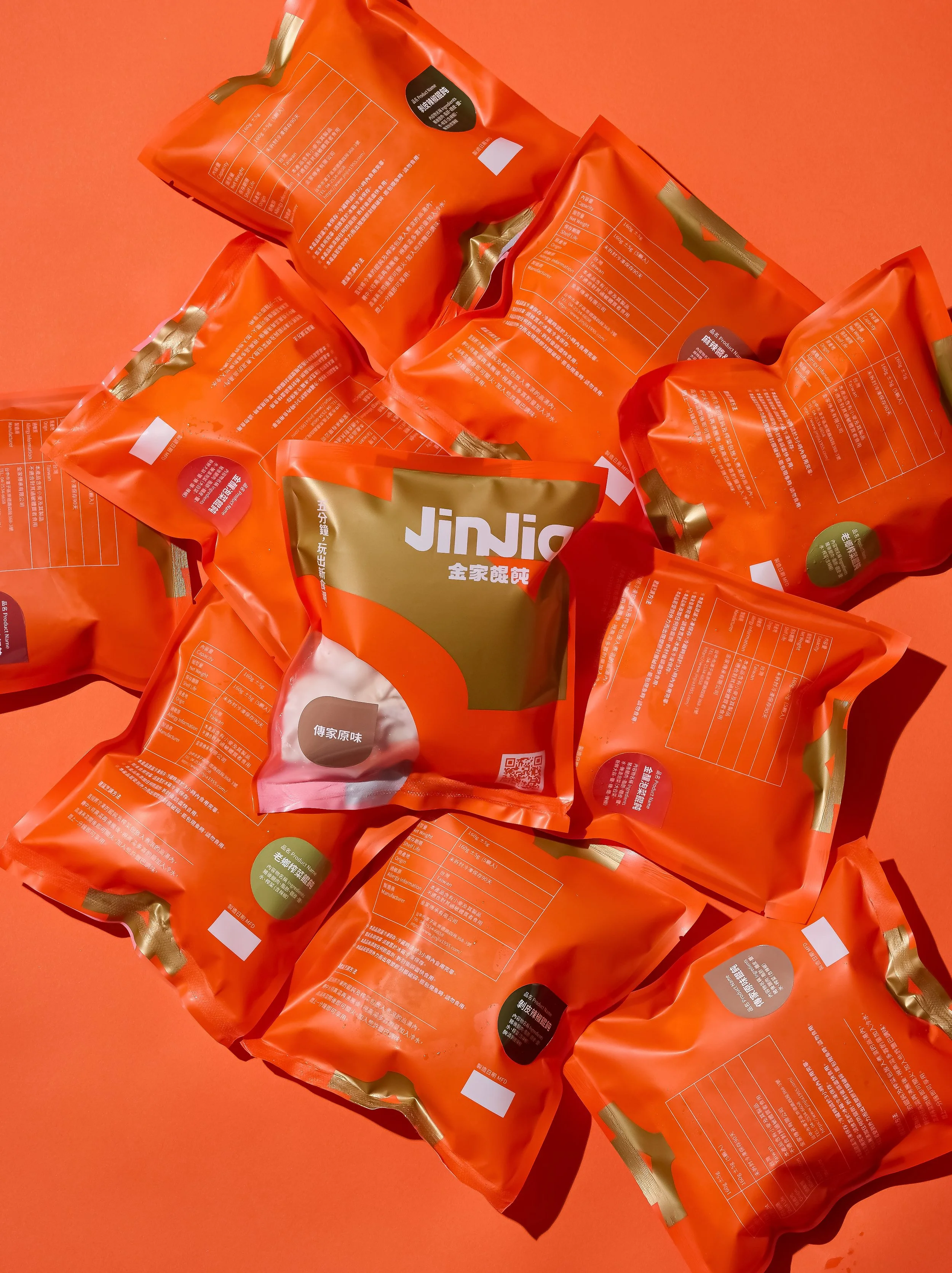
COLOR.
STRUCTURE.
Built a cohesive brand system
introducing a three-color strategy,
redesigning the logo,
and refining packaging architecture.
Transformed bulk family packs
into premium retail units.
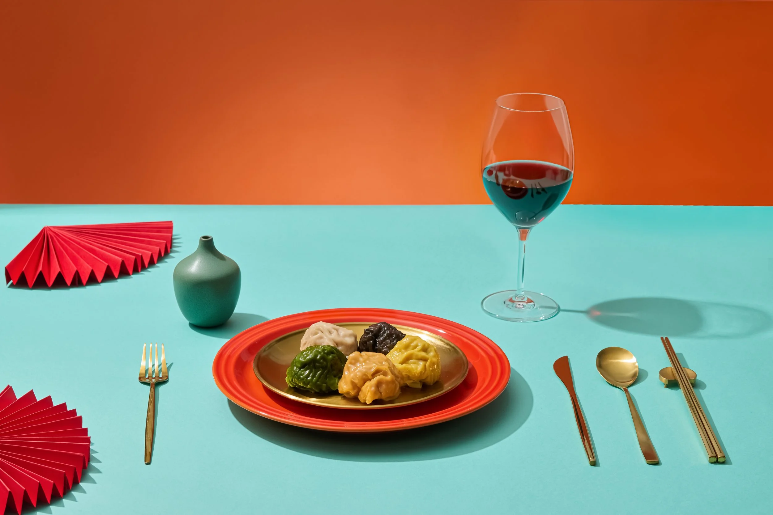
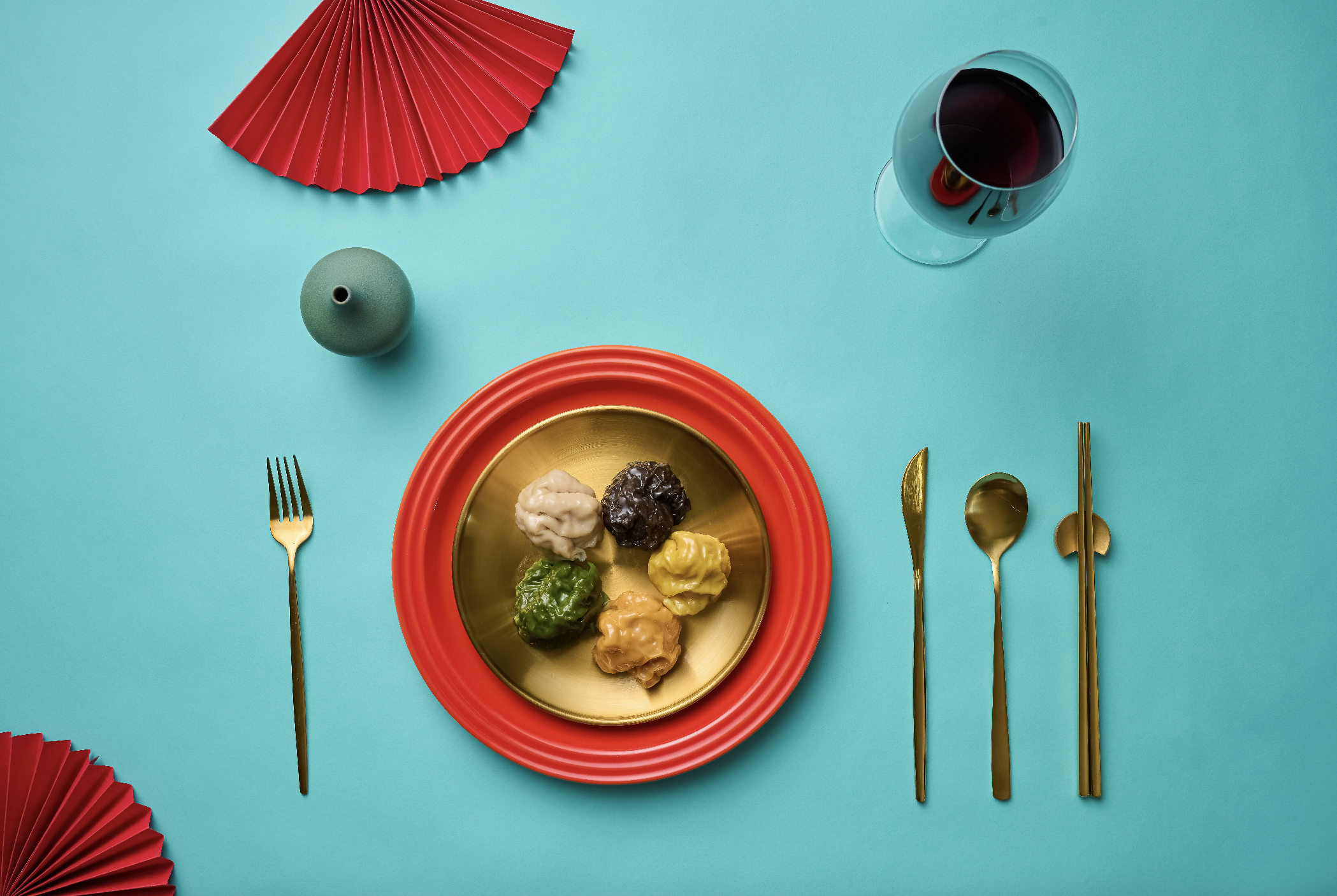
03
RETAIL
EVOLUTION
Extended the transformation
into retail and digital ecosystems.
Redefined naming,
established flavor-color mapping,
and executed a full visual rollout.
FROM FAMILY STAPLE
TO PREMIUM BRAND.
JINJIA evolved
from tradition-rooted comfort
into a curated premium retail identity.
Less about necessity.
More about desire.
BUILDING A COHESIVE BRAND SYSTEM.
We rebuilt JINJIA’s visual foundation
introducing a three-color strategy,
redesigning the logo,
and restructuring packaging architecture
for modern retail presence.
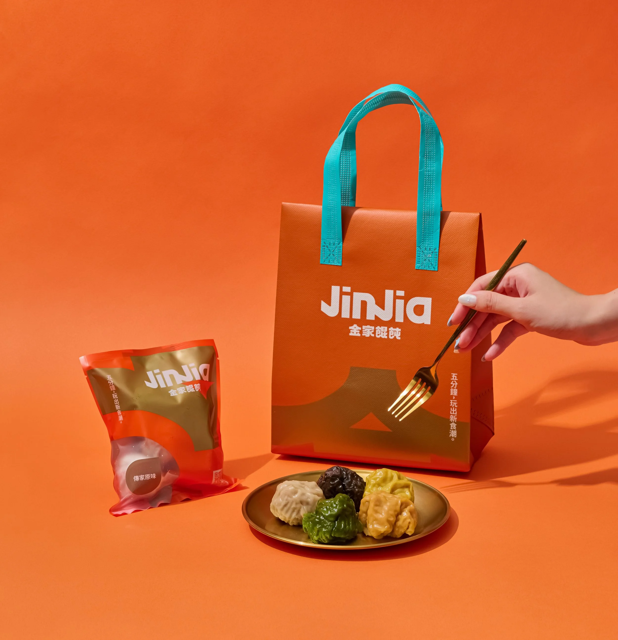
A COMPLETE BRAND ROLLOUT.
The transformation extended beyond packaging
into naming, retail structure,
brand collateral, website, and social presence.
A unified ecosystem.
Built for growth.
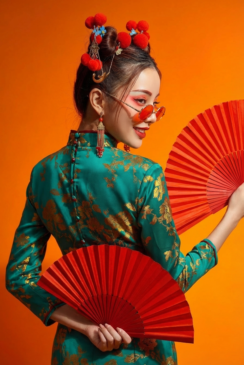
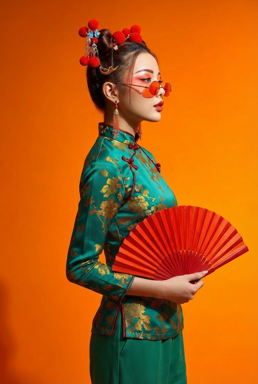
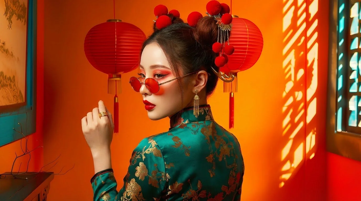
We developed a brand ambassador for JINJIA
framed by the vibrant JINJIA orange, a symbol of warmth and appetite.
Teal introduces creative energy and humor,
while gold preserves the brand’s legacy and craft.
Together, they express a heritage brand
reimagined for a new generation.
Classic in form.
Modern in attitude.
Passionate, confident, and subtly playful.
JINJIA Persona