
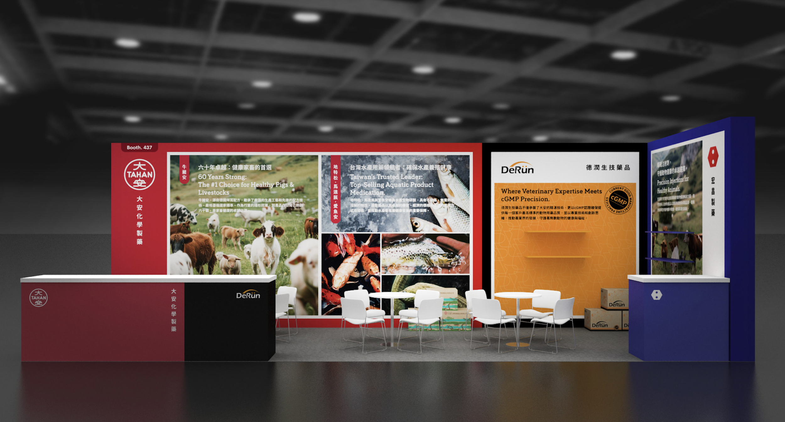
Three Brands. One System.
900 × 300 cm. Three booths. Three identities.
The challenge was not space —it was clarity.
We structured the environment through color hierarchy.
Red for legacy.
Orange for certification.
Blue for technical trust.
This was not booth design.
It was brand architecture in space.
❋
TAHAN 2025 Asia Agri-Tech Expo
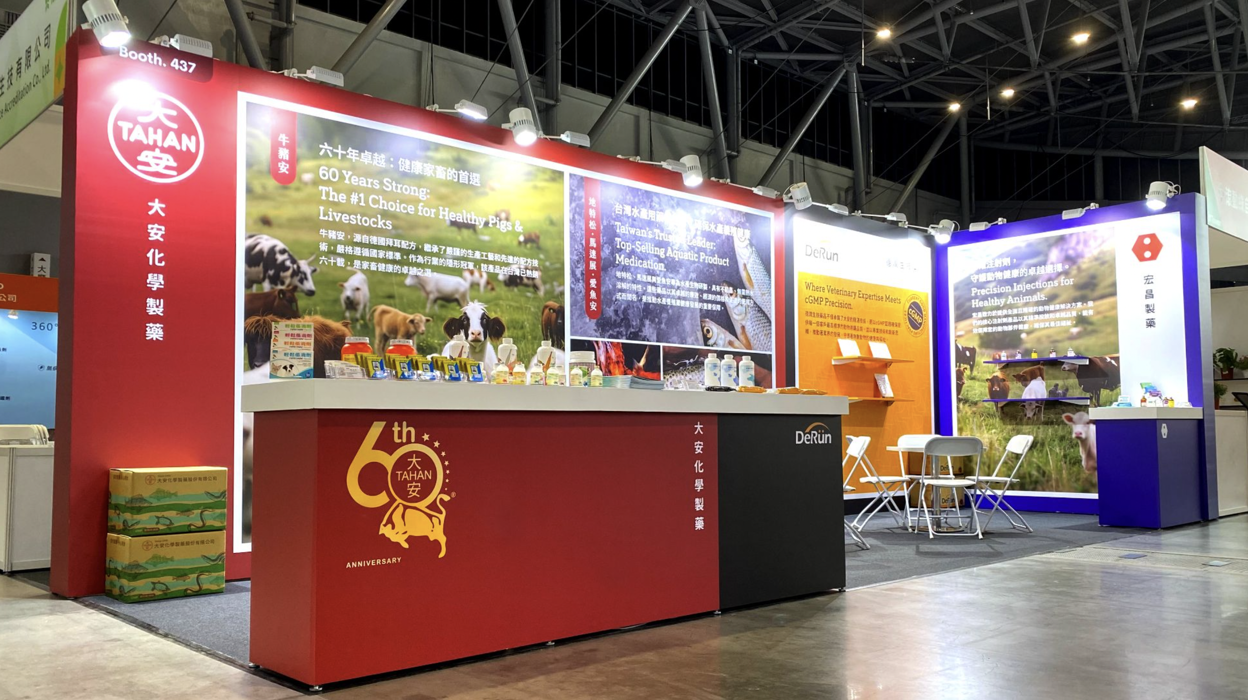
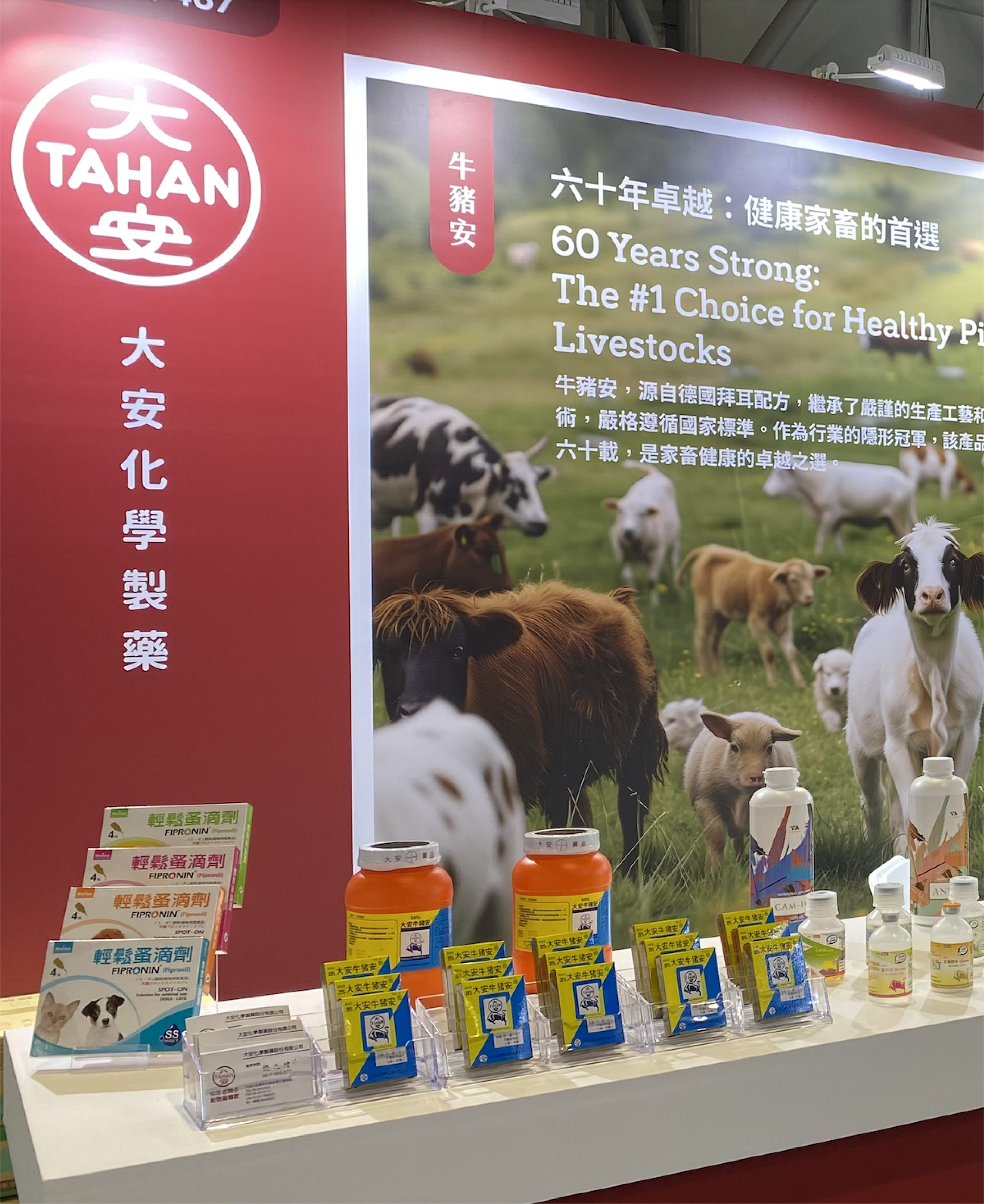
TAHAN.Red as Foundation. Red Defines the Origin.
Red represents legacy, authority, and market leadership.
For over 60 years, TAHAN has been the cornerstone of livestock health.
In space, it anchors the system.
Not just as a brand
but as the origin of trust.
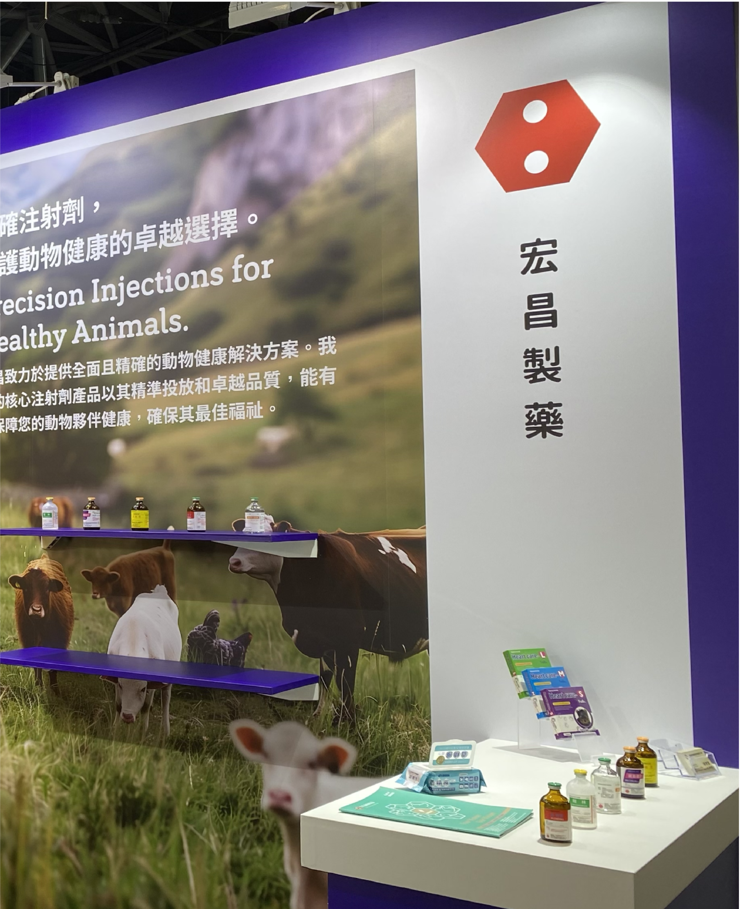
HUNG CHANG.Blue as Precision. Blue Frames Technical Accuracy.
Blue reflects clarity, control, and scientific reliability.
HUNG CHANG focuses on injection systems that demand accuracy.
In space, it sharpens the system
defining the specialist layer within the architecture.
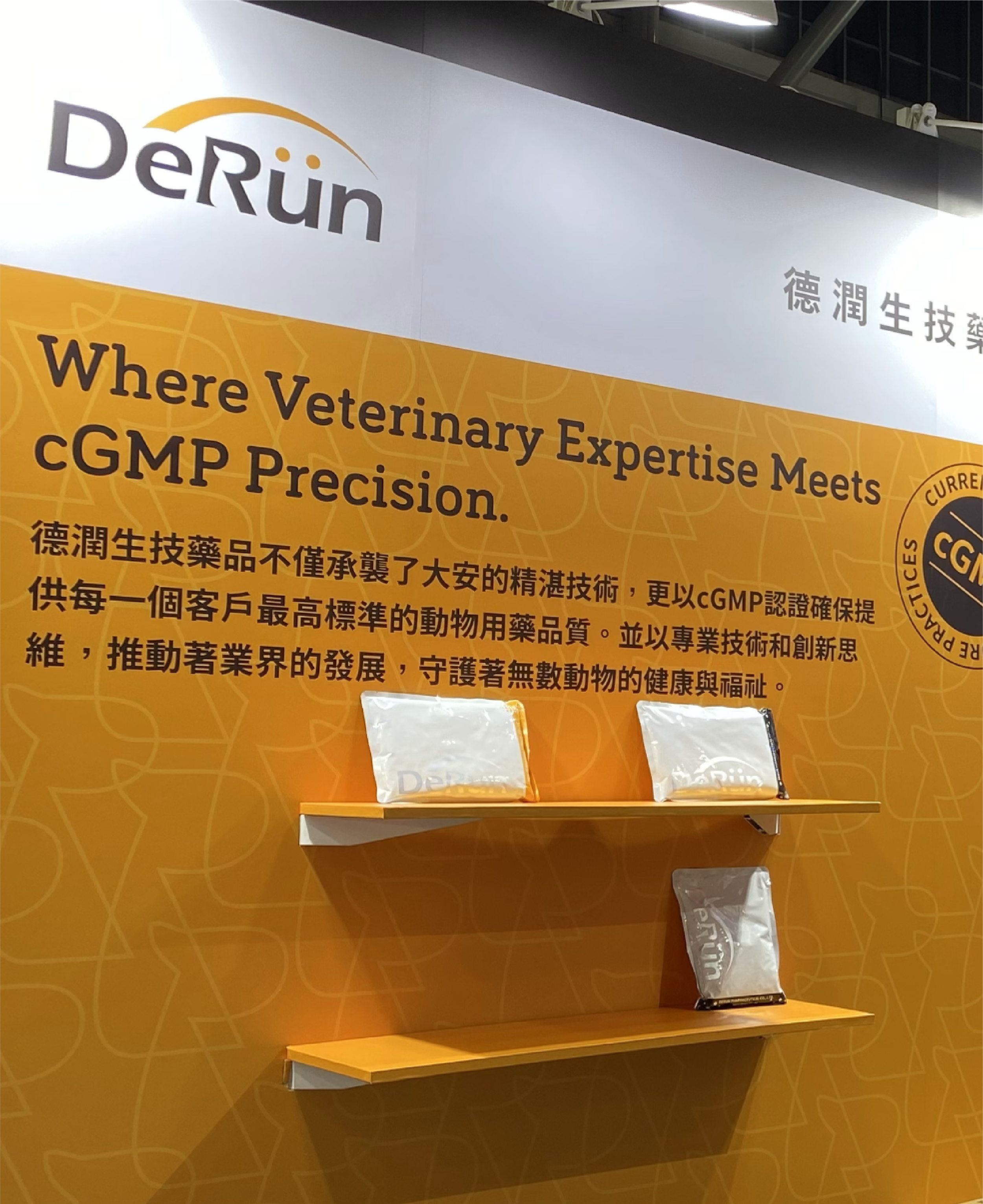
DERUN.Orange as Certification. Orange Signals Compliance.
Orange communicates precision, discipline, and certified production.
DERUN transforms technical heritage into cGMP-standard execution.
In space, it becomes the structural layer
the proof of regulated expertise.